The viewport and its units #
To size something as tall as the viewport, you can use the
vw and vh units.vw= 1% of the width of the viewport size.
vh= 1% of the height of the viewport size.
Give an element a width of
100vw and a height of 100vh, and it will cover the viewport entirely.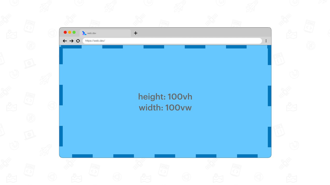
A light blue element set to be 100vw by 100vh, covering the entire viewport. The viewport itself is indicated using a blue dashed border.
The
vw and vh units landed in browsers with these additional unitsvi= 1% of the size of the viewport’s inline axis.
vb= 1% of the size of the viewport’s block axis.
vmin= the smaller ofvworvh.
vmax= the larger ofvworvh.
These units have good browser support.
Browser support chrome 20, Supported firefox 19, Supported edge 12, Supported safari 6, Supported
The need for new viewport units #
While the existing units work well on desktop, it’s a different story on mobile devices. There, the viewport size is influenced by the presence or absence of dynamic toolbars. These are user interfaces such as address bars and tab bars.
Although the viewport size can change, the
vw and vh sizes do not. As a result, elements sized to be 100vh tall will bleed out of the viewport.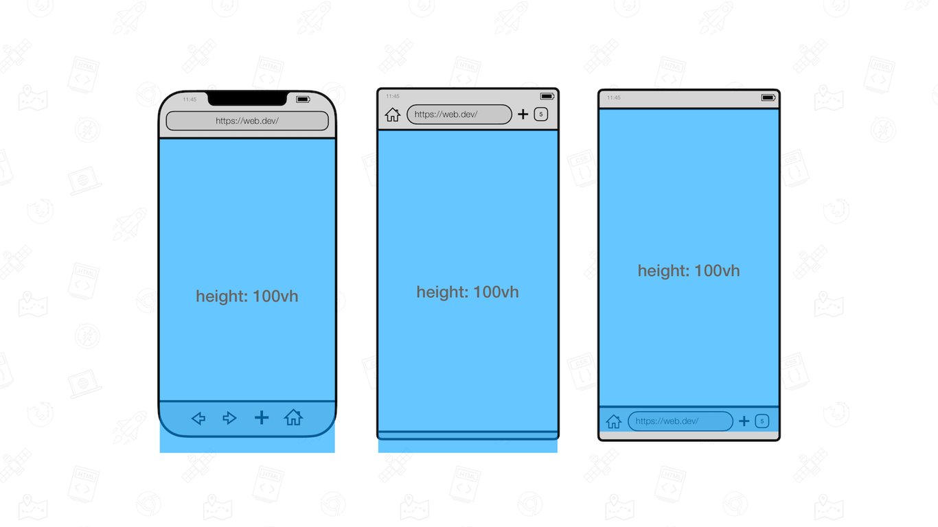
100vh on mobile is too tall on load.
When scrolling down these dynamic toolbars will retract. In this state, elements sized to be
100vh tall will cover the entire viewport.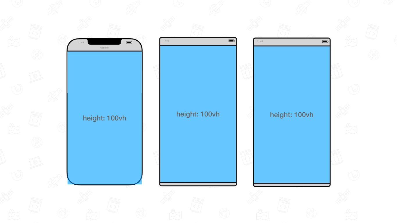
100vh on mobile is “correct” when the User-Agent user interfaces are retracted.
To solve this problem, the various states of the viewport have been specified at the CSS Working Group.
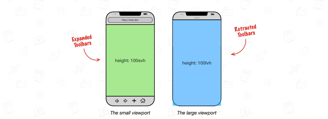
- Large viewport: The viewport sized assuming any UA interfaces that are dynamically expanded and retracted to be retracted.
- Small Viewport: The viewport sized assuming any UA interfaces that are dynamically expanded and retracted to be expanded.
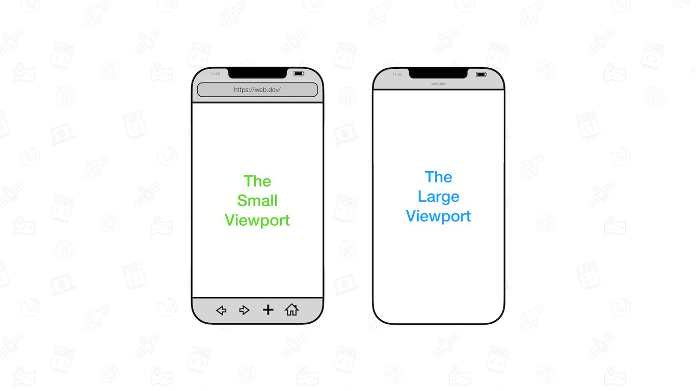
Visualizations of the large and small viewports.
The new viewports also have units assigned to them:
- Units representing the large viewport have the
lvprefix. The units arelvw,lvh,lvi,lvb,lvmin, andlvmax.
- Units representing the small viewport have the
svprefix. The units aresvw,svh,svi,svb,svmin, andsvmax.
The sizes of these viewport-percentage units are fixed (and therefore stable) unless the viewport itself is resized.
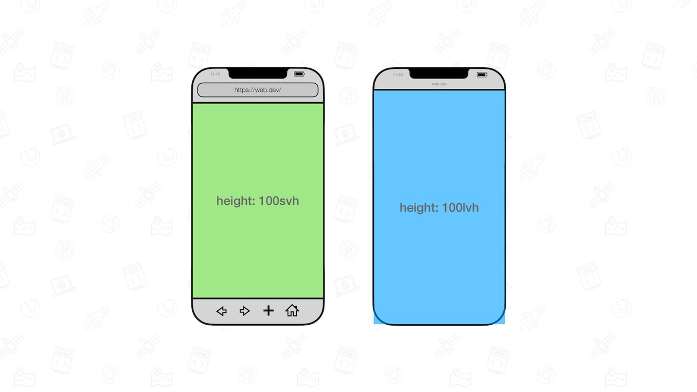
Two mobile browser visualizations positioned next to each other.One has an element sized to be 100svh and the other 100lvh.
In addition to the large and small viewports, there‘s also a dynamic viewport which has dynamic consideration of the UA UI:
- When the dynamic toolbars are expanded, the dynamic viewport is equal to the size of the small viewport.
- When the dynamic toolbars are retracted, the dynamic viewport is equal to the size of the large viewport.
Its accompanied units have the
dv prefix: dvw, dvh, dvi, dvb, dvmin, and dvmax. Their sizes are clamped between their lv* and sv* counterparts.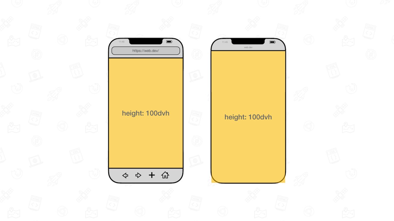
100dvh adapts itself to be either the large or small viewport size.
These units ship in Chrome 108, joining Safari and Firefox which already have support.
Browser support chrome 108, Supported firefox 101, Supported edge 108, Supported safari 15.4, Supported
Caveats #
There‘s a few caveats to know about Viewport Units:
- None of the viewport units take the size of scrollbars into account. On systems that have classic scrollbars enabled, an element sized to
100vwwill therefore be a little bit too wide. This is as per specification.
- The values for the dynamic viewport do not update at 60fps. In all browsers updating is throttled as the UA UI expands or retracts. Some browsers even debounce updating entirely depending on the gesture (a slow scroll versus a swipe) used.
- The on-screen keyboard (also known as the virtual keyboard) is not considered part of the UA UI. Therefore it does not affect the size of the viewport units. In Chrome you can opt-in to a behavior where the presence of the virtual keyboard does affect the viewport units.
Additional resources #
Additional reading material: